
Note from Brigit: I am so excited to welcome Beth Maiden to the Biddy Tarot blog this week. Beth is not only a talented Tarot reader & blogger at LittleRedTarot.com but also a gifted web designer (and feminist!). I invited Beth to share her top strategies for creating a beautiful Tarot blog. Take it away, Beth…
If you write a tarot blog (or indeed any kind of blog!) you probably know how important it is to make it look and feel good so that readers will enjoy visiting, will spend time reading what you have to share, and will come back again and again.
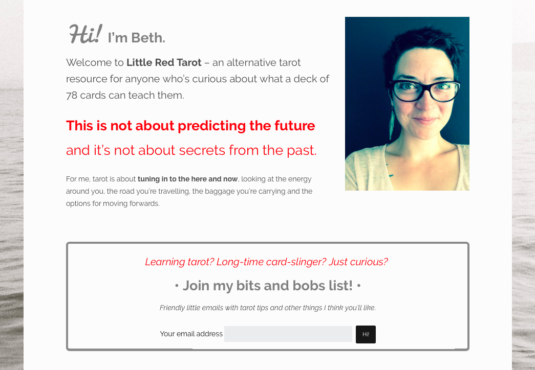
As a tarot blogger who is also a web designer, I get plenty of lovely feedback about my website, littleredtarot.com. I put a lot of love and energy into designing and building my site, and regularly tweak and tinker with the code in a continuing effort to improve my blog.
But you don’t need to know code or even host your own blog in order to create an attractive website. There are plenty of things you can do, from choosing clean, attractive templates in the first place to breaking up your content and taking better photos, all of which will help to engage visitors in your site.
Most bloggers (especially those who are passionate about their blogs) think of their websites as their online ‘home’- a space where visitors are welcomed and made to feel comfortable. We as much care and attention into the design of our sites as into writing our blog posts, ensuring that when guests arrive, the atmosphere is just right.
Here are five simple tips you can put into action today to help make your blog a more attractive and welcoming place to be.
Choose a nice colour scheme
This sounds obvious, but I’m often surprised (and put off) by the colour choices on some blogs. Of course some websites are meant to be explosions of colour and that’s awesome…but it’s hard to get this right. Easier than this is to put together a palette of colours you like (which don’t make your eyes hurt,) and use these consistently throughout your site.
Here’s a helpful post about creating a style guide for your blog by Sarah Morgan on XOSarah.com
If your theme or template doesn’t allow you to choose your own colour scheme, then consider switching to one that uses colours you really love.
Use plenty of good-quality pictures
Using images helps to break up your post which makes it easier for people to read…and keep reading.
Here are a few basic guidelines for using images on your site:
Quality matters! Your photos provide a visual indication of the overall quality of your blog and the amount of care you take over it. Low-quality pictures will put your readers off. If your phone camera isn’t very good, consider buying or borrowing a digital camera which produces decent-quality, non-blurry pictures.
Natural lighting. If you take a lot of photos of tarot cards or spreads, for example, find a table or sideboard near a window and use this for these shots – it will make a big difference to the quality and feel of your photos.
Make the best of your subject. If your post is about an actual tarot spread, consider photographing the spread directly from above, or, if it’s about a single card, you could play around with different ways of displaying that card, or use props (for example, in a post about the Page of Swords, I could emphasize the ‘communication’ element of this card by photographing it on a notebook.)
Use landscape photos where possible so as not to fill up the entire screen. If you do want to share tall images (which of course tarot cards usually are!), try taking a landscape photograph on a pretty cloth or table, or put two card images side-by-side to create a landscape image.
I do a lot of photography which means I’m never short of pics for my site. It’s worth getting into habit of taking photos of things you find beautiful or meaningful, so you can build up a cool image bank to pretty up your posts.
You could also try: 30 free stock photo resources for bloggers.
6,452 Tarot Enthusiasts Have Already Joined!
Are You Ready To Unlock Your Best Tarot Readings Yet?
Stop the guesswork in your Tarot practice. Discover clarity and confidence in every card you pull.
April 28th - May 2nd
Dive into five days of fun, intuitive learning with Brigit Esselmont—LIVE!
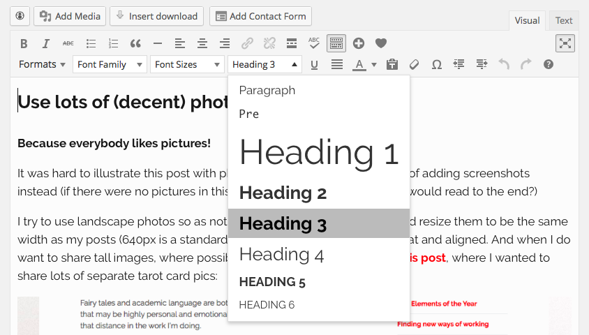
Use headings and sub-headings
Again, be aware that people’s online attention spans are embarrassingly short. Think of this as a whole different type of reading style –more like magazine-reading than books.
Often, people want to skim over your post (the way you flick through a magazine), clocking the headings to check your post is relevant before they dive in properly. As well as adding pictures, you can break up your paragraphs with headings to help readers see quickly that your post is something they want to read!
A typical post layout will have the title in Heading 1 – this will normally be determined in the site’s code. You can then try an opening line in Heading 2 (h2) and sub-headings throughout the post in h3.
Clear out your sidebar
When you start a blog, it can be tempting to put every widget going into your sidebar. Faces of all your Facebook friends, a long list of blogs you enjoy, comment counts, visitor numbers, subscribe links, monthly archives and more. But how much of it is actually serving a purpose?
Pruning your sidebar is a good way to get rid of unhelpful distractions and show your readers what you really want to share with them. It needs to be important if it’s going to pull their eyes away from your actual post!
Ask yourself what is the purpose of every widget, link, image or *thing* in your sidebar. Is it helpful to your readers? Does it direct them somewhere important? Or is it just there because you thought it was cool, or by default? Have a think about whether there are things you could remove from your sidebar.
Last but not least…white space
I bet the websites you most love to visit, the ones which feel like good places to hang out, and the ones where you stick around to read loads of content, have plenty of ‘white space’.
Space between lines on a page or post.
Space between the main content and the sidebar.
Space between widgets and menu items…
Lots and lots of space makes your website easy on the eye and clearer to read.
If you have access to your site’s code and are confident with things like padding and margins, you can increase white space this way. If not, look for themes or templates which have an uncluttered, spacious feeling.
So what do you do to make your blog look and feel nice? Share a link in the comments so we can all have a peek!
About Beth:
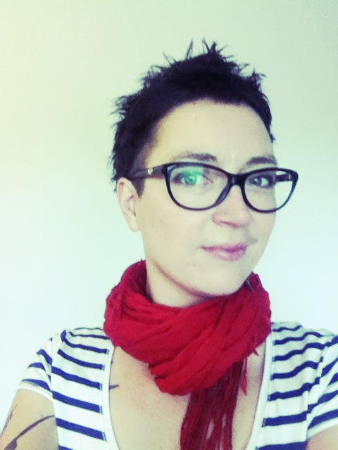
Beth Maiden in a tarot reader and writer based in Manchester, UK. She is the creator of Little Red Tarot and the Alternative Tarot Course, and lives on a boat with her partner and two cats.
When she’s not working with her tarot cards, Beth can be found out and about with her camera, cutting friends’hair, building websites or dreaming up new projects over a strong cup of coffee.
Find Beth online at littleredtarot.com or catch her on Twitter @littleredtarot http://littleredtarot.com


 Harness the wisdom of the Major Arcana with 22 guided meditations. Here’s what you’ll get:
 Create a deeply intuitive and personal connection to the Tarot cards with your very own Tarot Card Meanings Workbook. Here’s what you’ll find inside the workbook:
 Here’s what you’ll find inside for every card in the deck:
 Start doing deep, accurate readings TODAY with this step-by-step accelerated program for beginners.